Crown of Creation, The Menu!

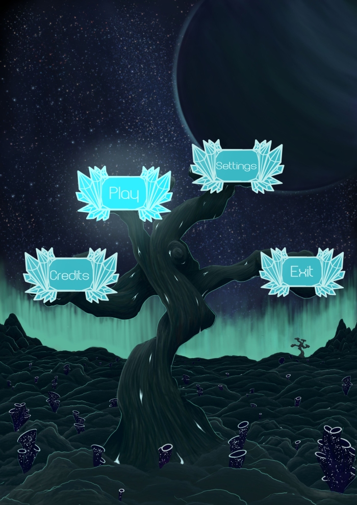
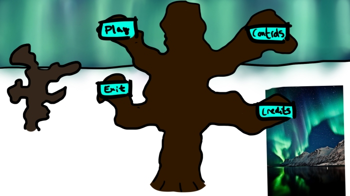
So, my mission was create the buttons for the main menu. Our first idea of how the menu was to look was that we had the large picture of the tree in the middle, and then we’d place one button on each branch. The main focus in the game is basically crystals, they represent energy and life, and they are all around you when you play. I figured I would make the buttons into crystals.

The style I used was inspired by an asset that we have used thoroughly throughout the game in many ways. It was created by Niki, and it looks like this.
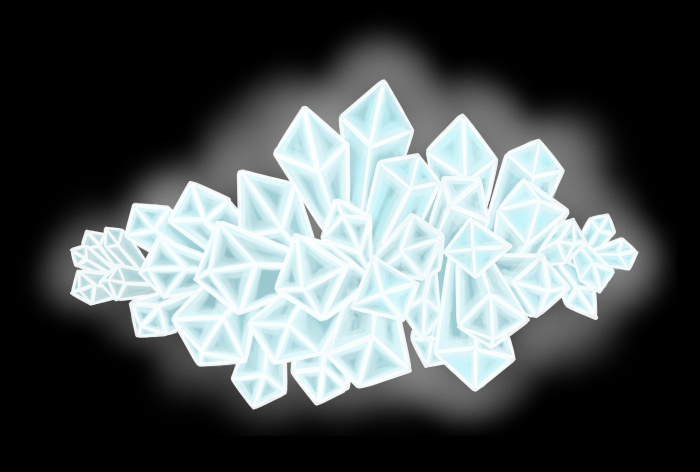
1.png

I used about the same thickness in the lines, and the color is not completely white. It’s slightly blue, so if I would want to change something about the crystals, I can easily do it in photoshop and the end result will still look united in a way. The mass of the crystals appear in a different. darker hue, since my buttons aren’t supposed to have a glow in their sprites. At first I did have a layer with the glow of the buttons, but our programmer notified me that it was excess material, and that it it  something that’s much easier to add in unity, of course, instead of having separate sprites for the glow. This resulted in less work for both of us.
5

Here’s a mock-up of the menu. So: I have the selected button “energized” and the rest de-saturated and without glow. CREDITS TO NIKOLA KUBASOVA FOR THE AMAZING BACKGROUND!

Early sketch for luls:
4.jpg

The font. At first I wanted a kind of jagged, scary type font, but the only ones that I could find from that description were too gore-y. The original concept of this game was very gore-y, but since we started working on it, we dropped the gore aspects.

I started searching for fonts with the keyword “crystals” instead, and these fit much better. Since the letter are actually ON a crystal, it makes sense that they’re crystal-like. Although the final font I selected doesn’t look like obvious crystals. I decided that since the actual button already has so much going on, it’d be best to stay simplistic on the font to improve the readability.

What went well?

I think I managed to make the buttons in the same style as the rest of the crystals in the game, and I’m also satisfied with the font that I chose. Also, the buttons fit the theme nicely.

What went less well?

I could have made the menu much more interesting if the different buttons had different shapes. This too would help with the readability, since the player would instead of reading what’s on the buttons, connect the different shapes of the buttons to the meaning. What would’ve been difficult with that is to come up with the different kinds of shapes, while sticking to the crystal theme, and have some sort of pedagogical meaning to it. But I guess you could maybe just make four differently shaped buttons with crystals around them.
Crown of Creation, The Struggle-Tile!

Hello!

This week, I’ve been working on the background tile for our game. It will be the base for the entire game, so the most important part was to make it connect well when looped.

I’d never done this before, so it was a bit of a challenge, and I had to repeat progress quite often since I had trouble implementing it. I wished for there to be a tile add-on to Photoshop, but alas! I had to do it myself. An exciting challenge.

One of the first things I had to do was to remove irregularities. There were some of the crystals that had a much richer blue color compared to the other ones. When looping this, a pattern was created that was so out of place that the tile looked cheap.

crystal_tile

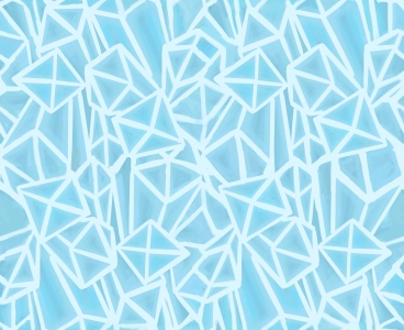
I began with sampling this asset that had been created by another artist from our group, and looped it several times with it’s unedited, rough edges to get a sense of if my sample would work or if it would create some odd pattern. I deemed this tile to be too repetitive, and made a tile with four versions of the original sample all rotated to a different angle than the other. This tile is shown in the next picture.

Looping this new tile looked much better, and me and my team decided that it looked good when looped. I then went forward making it loop smoothly.

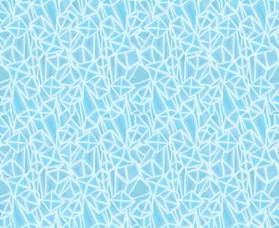
I did this by having one tile centered, and looping it once at the top, and once at it’s side. On a separate layer, I started to paint how I wanted it to look when looped. When I was happy with how it looked, I cut out the parts that I’d painted on the non-centered tiles, and put in in the same spot but on the centered tile.

crystal_tilez

This is the finished product, and it was going to be used as a main color background beneath a gradient lighting layer. Although it’s definitely not perfect, I’m still satisfied with my work, since it’s my first time doing a loop from these kinds of disproportionate edges! 🙂

If I were to add something to the tile to make it better, I would add more nuances to the crystal. Right now they are very flat, and the only way you could know they’re crystals is from recognizing the shapes as crystals. But the sampled asset I used for this tile is used frequently throughout the game, so I don’t think it’ll be an issue to the player.

The sad thing is that we’re not going to use it in the game unfortunately, which is a bit disappointing since I put so much effort to it, but I know that the background we’ll use in the game will look ten times more awesome! ⬛

Crown of Creation: The health bar

Hello! For this week’s sprint, one of my goals was to create a health bar

bar


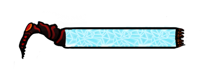
This is how I’ve created this prototype: I copied one of the main character’s legs and used the liquify tool to make it the size and shape I wanted, so that It could fit the shape I wanted while still having the exact characteristics as the main character. I then cleaned it up with a hard round brush the same size as the leg’s outlines. I then tried to merge the leg into the square bar.

The little thing on the far right side of the bar is the queen’s crown. Right now it’s blurry because I’ve upsized it from a PNG-file because I want one of the other artists in our team to re-create the crown to fit my bar, but I needed to visualize it first.

The leg going to embrace an orb, which holds a variable that is directly parallel to how filled the bar is, so that the player may look at either numbers for precision, or the bar, when you don’t really care about numbers and only want to shoot some bugz. The thought behind this is to encourage both casual and serious play (all the hardcore gamers are gonna play CoC, trust me. CS:GO is out of the league.).

The power that our main character uses is drained from crystals, so it was suggested that I made the full bar consist of a crystal asset that had been made to use for our backgrounds. I did raise the color intensity, so that the bar won’t disappear into the background. I had made a few prototypes on how I could make the full bar more interesting, for example every “tick” being a new crystal. Since we haven’t decided if the health bar should be divided into sections or rather be small ticks, I decided to scrap those ideas, even though I liked them more. Kill your darlings! 😦

Another suggestion that I really like is to make the upper and lower edges of the bar look more like the edges of the spider’s legs, so that it matches the little leg on the side. It would make it more organic, and further extend to the player that it’s the energy within the spider that is presented within the bar.

I still have many things to do, but am planning on finishing the bar tomorrow. What I want to do is to make the color of the bar more shiny/glowing as it is filled up, since that is when you are the strongest, and you are able to use your power-up. We need to communicate that to the player more clearly, since right now we don’t have a lot of feedback at all in our prototype, only on paper.

Looking forward to finishing it, since I’ve never worked on GUI before, this is quite exciting! 🙂 ⬛

Dev: Crown of Creation, Part 1, An Enemy

flying_bug_design


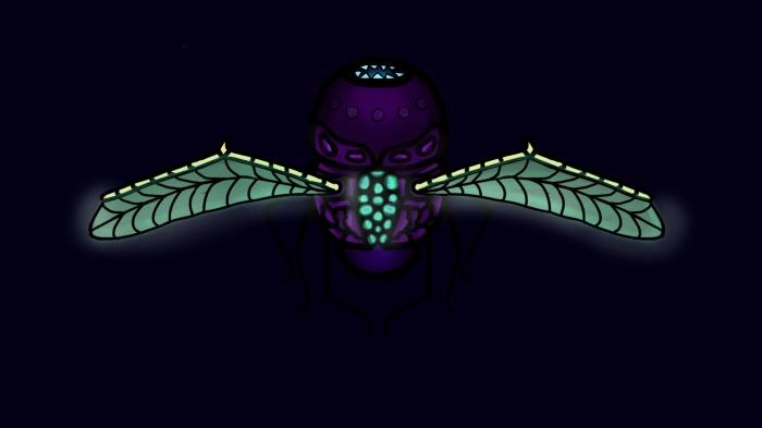
In our game Crown of Creation, we have designed three types of enemies, all of which are Bugs. I am responsible for two of them, and this is my second, of which I am very happy with the design, compared to my first one. The cyan color comes from energy crystals in the game. All living creatures use them to get power, so I needed the design to show that in some way. Since this enemy’s main design feature is its wings because it’s the only flying enemy in the game, I wanted them to have a cyan colored glow to them.

In the beginning, the wings were transparent, which I thought looked good and realistic. Although I’m not aiming for a realistic design, it still made sense for them to be transparent, and I’m aiming to modify that but right now I need to focus on other things. I also want to blacken the five eyes so that it’s more obvious that they are eyes.

One of our designers created the first design of a character to our game, and I have tried to use her art as a style guide. What inspired me most about her design is that she made a lot of small shapes on the exoskeleton, and that made it look creepy and very bug-like. This is why the torso has a lot of small shapes, in order for the bug to get some texture to it. I also wanted it to be more obvious to the player that the enemy has absorbed power from the crystals, so I opened up the back of the bug and made it’s “insides” glow cyan.

For inspiration to the shape of the bug, I googled terms such as “flying bugs” to get some ground to stand on. I quickly realized that most bugs have 6 legs and a pair of antennae as well as a body divided into parts. Usually a tiny head and a large body, although I didn’t want the design to look too much like a regular fly but with unnatural colors, so I reversed the order of the body parts. I was also a bit inspired by light bugs, and how their shiny butt part is usually exaggerated in animated movies, and added a separate butt part. I also thought it looked more fleshy and big/creepy, like how moths are grosser than butterflies because they have a fat body.

The background for our game is going to be dark blue, so I chose that for my file so that I would pick good colors for the design. The dark purple of the body is quite close to the background color, might be up for editing, but for now me and my QA/team think that it’s fine for now. We have yet to put the design in the game, or on an actual background from the group, but when we do we will be able to make a decision. ⬛